Paint Schoodic

To see more paintings, learn about workshops and classes, and more, visit my website.

Showing posts with label watercolor. Show all posts

Monday, March 7, 2022

Monday Morning Art School: that sinking feeling

Over time, the dark passages in an oil painting can grow hazy. In watercolors, the beautiful, jewel tone on the palette can look flat and dull after the paper dries. That’s ‘sinking’ color, and an ounce of prevention beats a pound of cure.
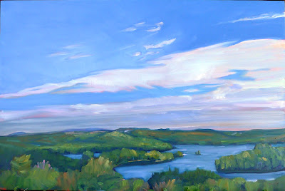
Clear Morning on Bunker Hill, 24X36, $3985 framed.

Oil painting: Sinking is caused by the displacement of the oil in the top layer. It’s most obvious in dark passages, but that’s only because the dusty haze is most visible there. It appears slowly over time—a painting that was once exuberantly colorful is suddenly dull. The different drying times of pigments means that color will sink unevenly across the canvas, giving it an irregular, blotchy look. Details that were once subtly beautiful will disappear.

Sinking can be repaired by oiling out or varnishing, but this may need to be repeated to keep the painting beautiful. If a painting is sold, you have no idea if it’s losing its color. It’s far better to do it right in the first place.
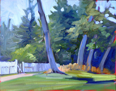
Tom Sawyer's Fence, 14X18, $1275 unframed.

Sinking has three common causes:

Too much solvent—the painter has not mastered the art of using unadulterated paint or painting mediums in the top layer. He relies too much on odorless mineral spirit (OMS) to get good flow. The OMS takes the place of the linseed oil binder and then evaporates. That leaves the pigment particles isolated, with no oil surround. Air doesn’t have the same refractive index as linseed oil, so a pigment that looks dark and beautiful in solution looks dull and grey when the binder disappears.

Not enough oil in the top layer of paint—this is why we keep repeating that old saw, ‘fat over lean.’ There’s enough oil in modern paints to make a solid top layer, but only if applied in proper thickness. If you want to paint thin, you must cut your paint not with OMS but with an oil-based medium.

Over-absorbent grounds—acrylic gesso is more absorbent than oil gesso, but a well-prepared acrylic ground is fine. However, a very inexpensive board may not have enough ground to stop oil from seeping through. An aftermarket coating of gesso is a good cure. Non-traditional grounds like paper and raw fabric need very careful preparation.

Bunker Hill overlook, full sheet watercolor, available. One of the advantages of Yupo is that there is no sinking.

Watercolor: “The difficulty in watercolors is not that it is ‘unforgiving’, as amateurs widely misbelieve: it is that it begs for fussing,” wrote Bruce MacEvoy. That fussing takes the form of overworking passages. Alla prima, or ‘on the first strike’ is vital in watercolor.

We want the pigments to stay on the top of the paper, rather than sink into it where they can’t be seen. The cellulose fibers of watercolor paper were laid down in a stiff mat so that pigments will sit nicely on top. Reworking wet-on-wet, scrubbing, and other repairs cause the fibers to unravel, creating a microscopic forest of random threads. Paint sinks into its crevices. The color is duller and, worse, blotchy.

The deck of American Eagle, from my sketchbook from Age of Sail workshop

Most watercolor paper is coated with gelatin or other sizing. This controls its absorption of paint. When you do a preliminary wash of color, you’re wetting the paper along with establishing primary shapes. If this wash layer is allowed to dry completely before the next layer is applied, the water and paint mix with the sizing and create a new layer, comprised of binder, sizing and pigment. That new, dense sizing layer can help hold successive layers of paint on the surface.

But if you ‘lick’ the wet paper constantly with your brush in an attempt to control minor flaws, you interrupt this process. Unless the paper dries completely between approaches, each pass with the brush lifts more paper fibers. That disturbance increases the capillary action that draws the pigment deeper into the paper. Overworked passages look dull and fuzzy.

Of course, the type and quality of the paper you use matters. Hot press paper is more tightly-compacted, making it more tolerant of overbrushing. Cold-press paper has less sizing and looser fibers. It tolerates less fussing.

Monday, January 10, 2022

Monday Morning Art School: the nocturne

Forget the fairy-lights; a good nocturne follows the same rules as any good painting.

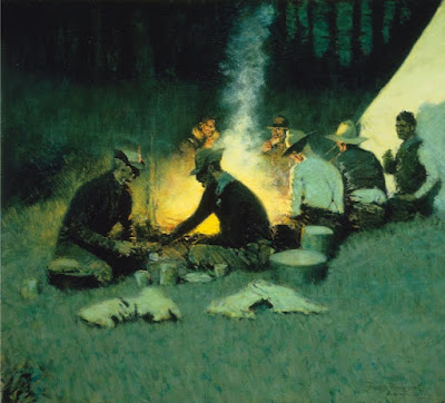
Hunter's Supper, c. 1909, Frederic Remington, courtesy National Cowboy and Western Heritage Museum

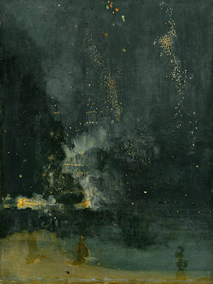
Nocturne is a term appropriated by James Abbott McNeill Whistler from music. Whistler used it to title works that evoked the sensation of nighttime or twilight. It didn’t mean just any painting done at night. The difference was whether the absence of light plays a role in the painting’s construction and meaning.

Prior to the Industrial Revolution, the night was a more powerful force than it is today. It’s no surprise that nocturnes have always had a place in art. Giotto’s The Kiss of Judas (c. 1304) is an early example. By the 15th century it was a tradition to set the Nativity and Annunciation to the Shepherds as night scenes, pitting the Light of the World against darkness for dramatic effect.

Nocturne in Black and Gold – The Falling Rocket, 1874, James Abbott McNeill Whistler, courtesy Detroit Institute of Art

The 17th century brought us chiaroscuro, tenebrism and three great interpreters of darkness: Rembrandt van Rijn, Georges de La Tour, and Caravaggio. In modern terms, most of their paintings aren’t considered nocturnes, because they’re set indoors. But they are nocturnes in spirit. Darkness is palpable and part of the message; it sits in counterpoint to the main theme.

It wasn’t until landscape painting came into its own that we started to see the development of true nocturnes under Whistler’s definition. Ironically, artificial light played a big part in this; it made it possible to paint at night.

Nocturnes are particularly associated with Tonalism, which eschewed the bright colors of Impressionism and Post-Impressionism in favor of neutral colors, diffused light, and soft outlines, all of which naturally suggest low-light situations.

Frederic Remington did about 70 paintings which we might properly call nocturnes before his premature death at age 48. He was very scientific and technical in his approach, which is no surprise for an artist who started as an illustrator.

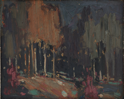
Nocturne, c. 1914, Tom Thomson, courtesy Art Gallery of Windsor

Remington's nocturnes are filled with color and light. Their composition is complex, often involving a foreground figure in silhouette, setting off the light source. He experimented with electric lighting and flash photography to make his paintings. That’s ironic in that they’re an elegy for the rapidly-disappearing pre-technological way of life. If you’re interested in the nocturne, the National Gallery’s The Color of Night is an excellent reference book.

Study Remington’s compositions; they’re energetic and well-realized. Too many nocturnes rest on the time-worn device of reflected light. These can be part of a great painting but they won’t carry the whole construction. A good nocturne follows the same rules as any good painting: it rests on a solid composition, it has an integrated color scheme, and its brushwork engages the viewer. If you don’t have those three things, go back to the drawing board.

Painting nocturnes en plein air requires a light. I have a cheap battery-operated book light; other artists use head lamps. The level of illumination should be kept as low as possible so that you don’t blind yourself to what you’re seeing.

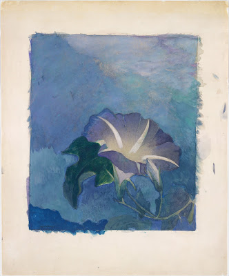
Nocturne, c. 1885, watercolor, John La Farge, courtesy Metropolitan Museum of Art

Plein air nocturnes are especially difficult in watercolor. Night air is damp, so paper doesn’t dry well (or at all). Watercolor is simply not designed for large masses of opaque darkness. Sometimes artists use ink instead of watercolor in the darkest passages; I’ve tried it and find it deadens the painting. In general, I’d suggest the watercolor artist start by drawing and move over to paint in the studio.

However, the above painting by John LaFarge suggests a workaround. He uses a medium blue in the place of black, and the viewer’s mind makes the substitution. It’s transparent enough that it would dry in the night air. A nocturne need not always be about the dead of night; it can be of twilight and dawn, too.

Regular readers know that I’m no longer taking beginning students, except in my boat workshops. Bobbi Heath is offering classes to new students in oils, and Cassie Sano has started her first session with watercolor (to rave reviews, I might add)

Bobbi’s classes are pre-recorded so students can go at their own pace. I am intimately familiar with her teaching style and material and know that you will be ready to paint with me when you’ve finished her program.

You can learn more here.

Granite State Gallery: New Hampshire Art and Artists through the Years will look at the history of New Hampshire’s native painters and visitors. It’s tonight at 6 PM, which means I can’t watch it live, so I sure hope they record it.

Wednesday, September 15, 2021

Afraid of the darks

It’s only when you’re no longer struggling to manage the technical problems that you can start telling a story with your brush.

Northern  New Mexico, 8X10, oil on Ray-Mar board, $522 unframed.

When teaching, I usually find myself sounding out little ditties with my brush rather than playing through the whole score. Nobody can absorb all the nuances of painting in one marathon demonstration; if that’s what they want, they’re better off buying a video and watching it repeatedly. I prefer to paint a passage that shows a solution to whatever problem is bedeviling my class at the moment. Rarely does that result in a fully-realized painting, but I feel that it’s the best way to teach.

Students setting up to paint in a quiet hamlet. What a paradise New Mexico is!

I was doing that yesterday, demonstrating how to hit a dense, rich color on the first strike. Watercolor students are often afraid of the darks, because they know there’s no going back from an incorrectly-placed deep passage. With few exceptions, watercolor doesn’t take correction well.

“That’s the bitch of watercolor,” I said, sadly.

“Ohhh, the Bitch of Watercolor!” someone riposted. “What a great title!”

My students. I love them.

"Enough of that stupid horse!" said Jimmy the Donkey. "Look at my beautiful Roamin' Nose!" That was the end of that painting.

The diffident watercolorist tries to circumvent their fear of darks by substituting a series of glazes. Glazing has its place, but you can’t use it in lieu of courage. Excessive glazing makes for muddy color and indistinct edges. The end result is lifeless. Paradoxically, that struggle against the darks sucks all the light out of the painting.

Just as watercolorists have problems with darks, some oil painters have an equal and opposite problem with light. They understand intellectually that they work from darks to lights, but they’re somehow unable to make the jump. Sometimes that’s caused by working in bright sunlight, which lies about the true values in our paintings. Or the painter thinks they should lay down a bunch of dark color and then lighten things by adding white into them. That’s a misunderstanding of indirect painting.

White, incorrectly used, makes for chalky color.

New Mexico can sure put on a show with her skies.

The problem may also be that they have too much solvent in the bottom layers. If those layers are too wet, nothing above them stays separated and clean. A good rule of thumb is that solvent gets used in the bottom layer only (and sparingly), paint in the middle layer, and paint and medium in the top layer. The fat-over-lean rule is not only archivally sound, it’s easier to manage.

Confident color is integral to alla prima painting. There is only one way to achieve this:

  • Draw well enough that you have confidence in where you’re placing your color, and,
  • Mix and test your color so you’re sure of it before it hits your finished painting.
My dog buddies came out to visit me, as they do every year. It's painful to see the grey in their muzzles and the hitch in their gitalong.

“Why this emphasis on process?” a student once asked me. “Shouldn’t art be about freedom of expression?” Well, yes and no. All expression rests on a firm foundation of technique. It’s only when you’re no longer struggling to manage the technical problems that you can start telling a story with your brush.

I’m teaching in Pecos, NM this week. Yee-hah!

Thursday, January 21, 2021

My students make me proud

Lemme show you some pictures…

Linda DeLorey, from a class assignment on painting snow.

I’m turning into one of those old ladies who carries photos around in her phone and shows them to total strangers. However, they’re not pictures of my kids or grandkids (or even the dog). Instead, they’re my students’ paintings. I’m very proud of them.

Amy Thomsen, from a class assignment on painting trees.

People are embracing distance learning, even in the evening after a long day of work. I don’t know if that’s because of the continuing reach of COVID, because it’s winter, or because the limits of geography are lifted.

David Broerman, from a class assignment on painting snow.

It’s turning out to be as much a group of friends as my summer plein air classes. On Monday night, talk turned to baking, a long digression that ended with Mark going to his refrigerator for his sourdough starter. My Tuesday class includes sisters who live across the country from each other. It’s all far warmer and personal than I ever imagined.

Mark Gale, from a class assignment on color substitution.
Lorraine Nichols, from a class assignment on color substitution.

I’ve written extensively about learning how to teach with Zoom. If there’s been a gift from 2020, it’s getting me over the hurdle of video. I used to loathe being on camera; now I don’t even notice it. There’s been lots of trial and error and I’ve upgraded my cameras and monitor. That was worthwhile. With the proper equipment the video barrier seems to evaporate.

Lori Capron Galan, from a class assignment on reflections.

I have Mary Byrom to thank; she's the one who coached and cajoled me past my resistance. That's why I pay the favor forward to other teachers when I can.

Carol Durkee, from a class assignment on color substitution.

Beth Carr, from a class assignment on color substitution.

Zoom has made me a better teacher. Instead of teaching reactively, I’ve been forced to be far more proactive in designing lessons. Teaching without geographical boundaries means I’m getting serious students. They’re working extremely hard, and every one of them is improving.

Sharyn Brusie, from a class assignment on reflections.

That's resulted in a long syllabus that will be the basis of a book, should I ever sit long enough to get some writing done (my New Year resolution.) 

Janice Vierke, from a class assignment on reflections.

We have a Facebook group where my students share recent paintings. I've nabbed some for you; I think they speak for themselves. There isn’t enough room in this blog to feature all of them, so I’ll catch up with the rest of them later. In return, I promise to not corner you at the grocery store and show you pictures of my grandkids, cute as they are.

Carrie O'Brien, from a class assignment on reflections.

Patty Mabie, from a class assignment.
Kathy Mannix has sold two paintings since starting my classes earlier this year. Amazing.

Mary Silver lives in the Texas hill country, where snow is generally just a happy dream.


Monday, January 18, 2021

Monday Morning Art School: different strokes

The best way to learn about your brushes is to experiment. Your brushwork contributes immeasurably to the quality of your painting. Don't dab or be diffident; plan your strategy and then execute it with boldness.

A spalter or mottler is a most useful watercolor brush.

On Friday, I gave you a guide to buying brushes. What are you going to do with these brushes now?

OIL and ACRYLIC

In the following illustrations, I've tried to keep the amount of solvent the same (except with the fan brush).


Above is a sable flat brush by Rosemary & Company. It can put down a very smooth surface and offers a lot of control, but it doesn't carry the quantity of paint that an equivalent bristle brush will. I save sable for glazing or blending.


This is a hog bristle flat brush. The paint it lays down is both rougher and more impasto than the sable.

Flat brushes make an immediate, energetic mark. They're excellent for fast, powerful surface work, long sweeping strokes, and blocking in shapes.

Used on their sides, they also make great lines, far more evenly than a small round can do.

Two rounds of very different sizes. A round is a more lyrical brush than a flat, and is a classic tool for painterly surface marks. It can be used to make lines that vary from thin to thick. A pointed round is used for fine detail. Bristle rounds tend to lose their points very quickly, however.

The great advantage of a filbert is the variety of brushstrokes you can get from one brush. This is great for single strokes that taper, such as in water reflections. Its rounded edges are good for blending. Set on its side, it makes nearly as good a line as a flat.

A bright is a less-flexible version of a flat. It's great for short, powerful strokes or situations where you want a lot of control.

A fan brush probably has no place in a plein air kit, but I carry one anyway. I use it for blending, as on the left, although some people like using it to make whacked out marks as on the right. The problem is, it can carry very little paint, so its marks tend to be either gooey, as above, or very abrupt.


In my studio, I just use a clapped out soft-haired brush to blend.

Many plein air painters also carry liners and riggers, which are useful in paintings that are built up smoothly. I don’t paint that way, so I seldom use them. Another brush that is good for detailed work is an angled brush. I don't have one of them, either. You can do almost any work you can envision with just the brushes I've shown you above.

WATERCOLOR

Watercolor brushes are softer than oil-painting brushes. The most expensive are natural bristles, and the difference is usually worth paying for. Natural bristles combine strength with suppleness and hold more paint than synthetics. Unlike oil-painting brushes, your watercolor brushes should last a lifetime, so buy the best you can afford.

In general, watercolor brushes drop more pigment the more vertically they're held. You can use this to move from a filled area to a broken one in one brush stroke. In all the following examples except for the mop, I've held the brush both ways. A good general rule is to carry the vertical brush slowly and in a controlled manner; pull a horizontal brush more rapidly to get the least amount of paint contact with the paper.

Made with the spalter brush at the very top of the page.

The brush I used for the photo montage at the top of the page is a 2" flat synthetic mottler or spalter brush. I like this shape for both oils and watercolor. It's a relatively inexpensive brush that gives a beautiful wash. It's useful for covering large areas quickly, but with precise edges.

A flat gives you good even washes. Used on its side, it can give you a controlled line.
A bright is a shorter version of a flat. More punch with less pigment.

Flats and brights give you nice flat washes, but can be used to make expressive lines as well. Brights have more control and carry less paint, just as they do in oil painting. Turn them on their sides to make a controlled line. Twisting the brush while painting gives an infinite variety of shapes. So too does varying the ratio of paint and water.

You can't do either of these things in any other medium.

Because of the way watercolor bleeds, its brushes can be used in ways not possible in any other medium--a long blend of different pigments, or by painting a shape in clear water and then dropping pigment into it.

Round brushes give more lyrical lines than flats do.

I don't normally carry riggers with me in either watercolor or oils. (They're meant to paint perfect lines, and my world-view apparently doesn't have many perfect lines in it.) Most of my line work is done with rounds. They do not give as much control on long lines, but they are very expressive.

A mop brush gives a perfect wash, but it does so much more as well.

Squirrel mops are the most uniform wash brush you can use. It's virtually impossible to make them skip, so use them where a lovely flat wash is a goal. But a good mop can also point, hold vast amounts of paint and sweep across the paper in style.

I think Guillo the dog ate my sea sponge.

Natural sea sponges are multi-purpose painting brushes. Use them to apply or remove paint. They can be as subtle or bold as you wish.


Thursday, January 14, 2021

The brushes you really need

You don’t need to spend a fortune to paint.

Channel Marker, 9X12, oil on canvas, available.

OILS and ACRYLICS

Expensive brushes are not the place to throw money for the beginning oil or acrylic painter—good quality paints are far more important. Still, brushes do change how the paint sits, and you need proper tools.

For alla prima painting in oils, you want long-handled hog-bristle brushes. They are less expensive than softer hairs like sable. I like Princeton 9700 series and Robert Simmons Signet hog bristle brushes.

Princeton also makes synthetic brushes that are good value for money—the 6300 series. Anything softer really isn’t appropriate for alla prima painting in oils. Acrylic paints will tolerate a little more flexibility, but avoid anything labeled for both watercolor and acrylic—they’re too soft. Princeton has a good chart of fiber stiffness, here.

Home Port, oil on canvas, available.

An assortment of rounds and filberts, a few large flats and an optional fan brush should suffice. More than a handful is overkill. Most workhorse alla prima painting happens between sizes #6 and #12, with a few smaller brushes for detail work, and larger brushes for bigger canvases.

If you like painting itsy-bitsy lines, invest in a rigger and a #1 round. I get more mileage out of spalter brushes, which are large, inexpensive flats for covering lots of area fast. I also keep a few soft sable brushes for glazing and blending.

Parrsboro Sunrise, 11X14, oil on canvasboard, available.

Bristle brushes tend to form a flag (a v-shaped split) at the end over time. If the brush is made properly, with good interlocking bristles, it will have a natural resistance to fraying. However, oil and acrylic brushes can’t tolerate letting paint dry into them, or being left standing on their bristles in solvent. You can wash brushes with Murphy’s Oil Soap, saddle soap (nice), specialty brush soaps, Fels Naptha, or even shampoo or detergent in a crunch. The important thing is that you do it promptly, before your paint has a chance to set up.

First, remove the solids by swishing them around in solvent. Then, put soap on a rag and work it into the bristles from the ferrule down to the bristles’ end. Be sure you’re washing the inside bristles, not just the surface. Repeat until the suds run clean. Shake excess water out, shape the brush slightly with your hand, and let it air dry.

Sometimes it rains, oil on canvasboard, available.
WATERCOLOR

Brushes are far more important in watercolor. I like Rosemary & Co. but they are very expensive. I recommend Princeton Neptune brushes for new painters. A ½” flat, a 1” wash brush, a #6 quill and a #8 round will get you started. If you’re going to invest in a mop, squirrel is better than synthetic. A set of short synthetic flats (or mottlers, as they’re sometimes called) in ¾”, 1” and 1½” will round out your collection.

Riggers and liners are tiny brushes for making very fine lines. They’re more useful in watercolor than they are in oils, in my experience. I buy the cheapest ones I can find because I’m always wrecking their points.

Lastly, you should have a scrubber to take out mistakes. You can buy them purpose-built, or you can just use an old hog-bristle brush.

Never leave your brushes standing in water, even as you work. Cleaning watercolor brushes is far easier than cleaning oil brushes. Hold them under the tap and let the pigment wash off with the flow of the water. I have never washed my brushes with soap, but if you find your synthetic brushes have stained, you can use a small amount of bar soap on them. Squeeze the water out and reshape the heads. That’s all there is to it.

Wednesday, December 16, 2020

A little knowledge is a dangerous thing

Chemistry was my worst subject, so it’s ironic that it plays such an important role in painting.

Blueberry barrens, watercolor on Yupo, Carol L. Douglas, available through Maine Farmland Trust Gallery.
My students ask me, on average, a question a week that I can’t answer. Often, these revolve around chemistry. This was my worst subject, so it’s ironic that it plays such an important role in painting. Because I care about the survival of paintings, I really wish I’d paid more attention in high school. Let that be a lesson to you, kids.

I like painting with saltwater in my watercolors. It’s a habit I picked up from Poppy Balser, who also lives along the North Atlantic. It encourages the separation and granulation of the colors, adding just a bit of texture to the whole process. In addition, I occasionally—like many other watercolorists—add salt to create more texture.

Float, watercolor on Yupo, Carol L. Douglas, available.

“But won’t salt degrade the paper?” a student asked. In searching the internet, I found dissenting opinions. The ones that said it would, thought it would do so by lowering the pH of the paper. Acidity is the enemy of paper, a fact known even to dolts like me.

Now, the idea that salt was acid-forming didn’t make much sense to me. Table salt is neutral; you can tell by its taste. I asked my husband, who had the same chemistry teacher as me, but was good at it. He mumbled something about salts being chemical compounds consisting of cations and anions. Suddenly, I remembered just what it was I disliked about the subject.

Bunker Hill Overlook, watercolor on Yupo, Carol L. Douglas, available .

Well, it would be easy enough to test, I thought. I just needed to find some pH test strips. That was complicated a bit by the fact that we live a little to the north of nowhere, and everyone sensible has left for the winter. Eventually, I ordered some online.

At the post office, I tucked them in my jacket pocket. They were promptly filched by my dog. I can now tell you that my dog’s saliva has a pH of 8.5. This is, interestingly, considerably more alkaline than human saliva, which I looked up. Our mouth drippings have a pH normal range of 6.2-7.6.

What was left of my test strips after Guillo ate them.

There were enough strips left to test the raw paper (Strathmore), an area where I’d painted without salt, and a section where I’d used enough salt to create a new ocean. Both painted samples were slightly more acidic than the unpainted paper itself, which was neutral.

Any real scientist would be appalled by my technique. I wet the paper with the spray bottle in my watercolor kit. That contains common tap water, but I figured that whatever impurities it contained would affect all the samples equally. I then stuck the samples down with my index finger—more or less clean—and waited. But I think the results were good enough to tell me that salt doesn’t really affect the pH of the paper. But paint itself does.

My conclusion: salt doesn't make any difference, but paint itself does.

All of which reminded me of a hoary old joke you hear from kids, about dihydrogen monoxide, which is a colorless, odorless, tasteless liquid that’s in everything we eat or drink. I was thinking about it when I rinsed my hair with the stuff this morning, after scrubbing it with a chemical bath that was a surfactant combined with a co-surfactant, and then rinsing with a polymer. Why do we find the results of that so pleasant, and our dirty hair so offensive?

But, more importantly, I was thinking of a little ditty that’s been with us since the early 18th century:

A little learning is a dangerous thing;
drink deep, or taste not the Pierian spring…
(Alexander Pope)

It’s why I discourage people from making their own mediums, experimenting with substrates, etc. Painting is hard enough when we’re using proven technique. It’s hard enough for conservators to preserve paintings that were done properly. Why make things more difficult?