Avoiding black keeps you from some of the most elegant colors available in painting.
 |
| Vineyard, 30X40, oil on canvas, available. Black can make a whole array of beautiful greens. |
One of the absurdities of 20th century art education was the injunction to ‘never use black.’ That limits artists from some of the most elegant colors available in painting. The argument is supposedly based on Claude Monet’s palette; he never used black and you shouldn’t either. Like the so-called Zorn Palette, that’s a stew of half-truth and myth. Most artists’ palettes shift over time.
Asked in 1905 what colors he used, Monet said: “The
point is to know how to use the colors, the choice of which is, when all's said
and done, a matter of habit. Anyway, I use flake white, cadmium yellow,
vermilion, deep madder, cobalt blue, emerald green, and that's all.” But
earlier in his career, he certainly used a wider palette, including black.
 |
| The Servant, 36X40, available. Black is invaluable in creating skin tones. |
The argument went that Impressionists avoided black because it doesn’t exist in nature. Black certainly does exist in nature: in basalt, in deep shadows, and in the subtle undertones in animals and people.
Moreover, it was argued, the painterly effects created
by managing warm and cool hues are richer and brighter than those created by
manipulating tones and shades. They’re more brilliant, certainly, because
adding black (or white) always reduces chroma. But part of painting is the
dance between high chroma and neutrals.
Anyway, Monet’s buddy and fellow founder of Impressionism Édouard Manet used
black paint by the bucketful.
Monet said a mouthful in that quote, however, and it wasn’t
the list of colors (most of which would not be great choices in the 21st
century). Most of us choose paint colors purely out of habit. We become
familiar with them and develop deep loyalty to them. That’s smart, as long as
we choose wisely to start with.
But then the painter often gets into the bad habit of only
mixing colors in a certain way. And that, in the tail end of the 20th
century, meant never using black.
Obviously,
you should never make grey by mixing black and white, because it’s lifeless. But
there are many subtle colors available only through black admixture.
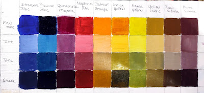 |
| Black admixture chart of my palette. You should make one too. |
- Tint is a mixture of a color with white;
- Tone is a mixture of a pigment with grey (black plus white);
- Shade is a mixture of a pigment with black.
What we consider acceptable in color-mixing is style-driven,
just like everything else. For example, see the Permanent Pigments Practical
Color Mixing Guide of 1954, below. It’s all about making shades and tints.
That’s a hint about why mid-century paintings looked so grey, and probably why
the pendulum then swung so far in the other direction. A little shading goes a long
way.
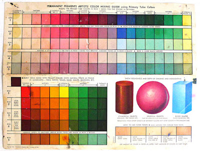 |
| Yes, it's a mess. It's been kicking around various paint boxes in my family since 1954. |
This product was a response to market demand. It’s very hard
to paint without some black on your palette, and the real stuff was banned by
the cognoscenti. But when I was in school (she says with a geriatric cackle) chromatic
black was something we were taught to mix. That’s a valuable exercise in
complements. Buying it premixed in a tube circumvents the point.


