Color is the dominant theme of our age.
 |
| Autumn trees, undated, Wolf Kahn, from a commercial lithograph |
Wolf Kahn was a mid-century American landscape painter who was influenced significantly by Abstract-Expressionism and Color Field painting. The fog on Deer Isle, Maine led to an epiphany about color: “I began to let the color come through on my canvases,” he wrote. “My pastels were always intense, and finally my painting caught up with them.”
 |
Brilliant Green Trees, 1997, Wolf Kahn, courtesy Walter
Wickiser Gallery |
Kahn’s canvases are deceptively simple. What can we learn from them?
Color is the dominant theme of our age
That was beginning to be true in the 1960s when Kahn was coming
into his own, but we now live in the full maturity of color. We are surrounded
by a surfeit of chromatic intensity. Imagery has always been influenced by what’s
around us, and today that’s our cell phones, monitors, and televisions.
Printing technology is far better than it was even thirty years ago, so the
photos in our books are clearer and brighter than ever. Paint and pigment technology
have undergone similar improvement, which is why we’re seeing houses with navy
blue vinyl siding—they’ve managed to make a dark blue that doesn’t fade.
Will this trend last forever? For all I know,
there will be an equal and opposite reaction into monochrome. But for the
moment, we’re living in an age of intense color, and if you are painting in our times, you’d best know how to use color.
That includes understanding and using modern organic pigments.
 |
Midsummer, 1993, Pastel, Wolf Kahn, courtesy Walter
Wickiser Gallery |
The ‘real’ hue is irrelevant if the value is right
Kahn is famous for substituting impossible colors into the
landscape: orange scrub, fuchsia woods and purple hills. One of his favorite techniques
is to make the trunks of saplings the exact same value as the background, but
the complementary color. The brain reads this as the screen of trees.
Stripped down to their essential form, objects are still
recognizable to the human brain
Our minds are programmed to read images from the faintest
stimuli, which is why we see faces in the steam on our shower door. This tendency
to perceive meaningful images in ambiguous visual patterns is called pareidolia
This is not a purely human response, either. Occasionally,
one of my hiking trails will be blocked off with a sawhorse festooned with
signs. Until he’s close enough to investigate them, my dog finds these shapes very
threatening. He’s seeing a vaguely-animal shape.
Our human pareidolia is the same response. We’re programmed
to investigate visual stimulus that looks sort of familiar. Kahn and other
abstract artists are exploiting this.
That’s an aspect of modern art that is likely to stay with us,
as it’s built on our fundamental brain architecture. If we want to paint
within our times, we need to stop spelling everything out.
 |
Reluctant Green, 2001, Wolf Kahn, courtesy Walter
Wickiser Gallery |
It’s all an interplay of warm and cool
While Kahn’s selection of substitutionary colors might seem random, he is careful about color temperature. Where he wants objects to recede, they’re cool. Where he wants them to pull, they’re warm. Again, he’s playing with our brains and eyes and how they’re designed to perceive color.
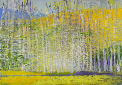 |
| Bright Center, 2015, Wolf Kahn, courtesy Addison-Ripley Fine Art |
Chromatic intensity matters
In most instances in Kahn’s work, one hue leads. That color
is given the greatest chromatic intensity. In others, two colors are balanced
in chromatic intensity, but one leads by virtue of being warmer. None of this
is accidental. Kahn was acutely aware of chroma and its importance.
We painting teachers bang on and on about value,
and it’s certainly fundamental. However, color temperature and chroma
are also important.