Paint Schoodic

To see more paintings, learn about workshops and classes, and more, visit my website.

Wednesday, May 4, 2022

Plein air painting on the cheap

If you’re trying painting for the first time, it makes sense to use less-expensive equipment and supplies. Here are corners you can cut.

Early Spring on Beech Hill, 12X16, oil on canvas, $1449 framed includes shipping to continental US.

In 2018, when I first wrote about plein air painting on the cheap, this pine tripod easel cost $7.99. It’s ‘on sale’ for $14.99 now, a whopping 53% price increase in four years. That’s precisely why, if you’re interested in trying plein air painting for the first time, you should probably think about ways to do so on the cheap.

That’s the same easel I learned on in high school. I still have it today, tucked into the corner of my studio. It’s rickety, awkward—and it works. It was a standard style field easel until the invention of pochade boxes that screw onto tripods. My father painted his whole life with a similar, home-made model.

Bridle path, 11X14, $1087 framed includes shipping to continental US.

This easel, however, requires some sort of table. My thrifty friend Catherine uses an old TV table, but there are lighter versions now available.

I wrote recently about pochade boxes for every budget. Dollar Tree’s 9X13 baking pan has only gone up to $1.25, so you can still make the cheapest possible palette for $2.50, plus duct tape. What I neglected to mention in that post was the possibility of buying a used pochade box. Some of my best art tools were purchased second-hand. But you must have the time to be patient.

If you’re handy, you can make one like I did. Or, there's the classic cigar-box pochade.

Best Buds, 11X14, $1087 framed, includes shipping to continental US.

One of the great advantages of watercolor is that it doesn’t require any easel. Many studio oil painters sketch in watercolor in the field. A Winsor & Newton Cotman field set and a watercolor journal are a cheap, lightweight introduction to wilderness painting. That’s essentially what Thomas Moran carried on the Hayden Expedition to Yellowstone in 1871. He’s known as an oil painter, but his watercolors have an important place in art history.

In every media, the difference between professional and student grade paints and pastels is the amount of pigment and the quality of the binders. In some cases, more expensive pigments will be copied with hues. A hue mimics the color of a single-pigment paint with less-expensive materials. For example, “cerulean blue hue” is often a combination of zinc white and phthalo blue.

A better solution is to avoid pricier pigments in the first place. In earth colors, there’s almost no difference between the student brand and the professional brand. The difference shows up in paints like the cadmiums, where the pigment itself is expensive. There are modern substitutes that do the job equally well at a lower cost.

Blueberry Barrens, 24X36, $3985 includes shipping in continental US.

There are decent student-grade brands out there in all media:

Oils: Gamblin 1980 and Winsor & Newton Winton.

Acrylics: Winsor & Newton Galeria and Liquitex.

Watercolors: Winsor & Newton Cotman or Grumbacher Academy.

Pastel: Alphacolor Soft Pastels

If you decide you love plein air painting, you can replace these student-grade colors with professional-grade paints over time.

Brushes don’t have to break the bank either. Even though I have a slew of fine watercolor brushes, I still reach for my Princeton Neptunes. Oil and acrylic are trickier since cheap brushes sometimes drop bristles in your work. Princeton also makes good, inexpensive oil/acrylic brushes, especially their 5200 and 5400 series. If you want a synthetic brush, make sure it imitates hog bristles, not sable. A softer brush isn’t meant for alla prima painting.

It's plein air season again. Check out my workshops, here.

Monday, May 2, 2022

Monday Morning Art School: what we can learn from Wolf Kahn

Color is the dominant theme of our age.

Autumn trees, undated, Wolf Kahn, from a commercial lithograph

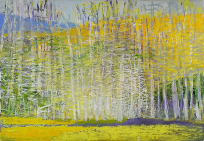
Wolf Kahn was a mid-century American landscape painter who was influenced significantly by Abstract-Expressionism and Color Field painting. The fog on Deer Isle, Maine led to an epiphany about color: “I began to let the color come through on my canvases,” he wrote. “My pastels were always intense, and finally my painting caught up with them.”

Brilliant Green Trees, 1997, Wolf Kahn, courtesy Walter Wickiser Gallery

Kahn’s canvases are deceptively simple. What can we learn from them?

Color is the dominant theme of our age

That was beginning to be true in the 1960s when Kahn was coming into his own, but we now live in the full maturity of color. We are surrounded by a surfeit of chromatic intensity. Imagery has always been influenced by what’s around us, and today that’s our cell phones, monitors, and televisions. Printing technology is far better than it was even thirty years ago, so the photos in our books are clearer and brighter than ever. Paint and pigment technology have undergone similar improvement, which is why we’re seeing houses with navy blue vinyl siding—they’ve managed to make a dark blue that doesn’t fade.

Will this trend last forever? For all I know, there will be an equal and opposite reaction into monochrome. But for the moment, we’re living in an age of intense color, and if you are painting in our times, you’d best know how to use color.

That includes understanding and using modern organic pigments.

Midsummer, 1993, Pastel, Wolf Kahn, courtesy Walter Wickiser Gallery

The ‘real’ hue is irrelevant if the value is right

Kahn is famous for substituting impossible colors into the landscape: orange scrub, fuchsia woods and purple hills. One of his favorite techniques is to make the trunks of saplings the exact same value as the background, but the complementary color. The brain reads this as the screen of trees.

Stripped down to their essential form, objects are still recognizable to the human brain

Our minds are programmed to read images from the faintest stimuli, which is why we see faces in the steam on our shower door. This tendency to perceive meaningful images in ambiguous visual patterns is called pareidolia

This is not a purely human response, either. Occasionally, one of my hiking trails will be blocked off with a sawhorse festooned with signs. Until he’s close enough to investigate them, my dog finds these shapes very threatening. He’s seeing a vaguely-animal shape.

Our human pareidolia is the same response. We’re programmed to investigate visual stimulus that looks sort of familiar. Kahn and other abstract artists are exploiting this.

That’s an aspect of modern art that is likely to stay with us, as it’s built on our fundamental brain architecture. If we want to paint within our times, we need to stop spelling everything out.

Reluctant Green, 2001, Wolf Kahn, courtesy Walter Wickiser Gallery

It’s all an interplay of warm and cool

While Kahn’s selection of substitutionary colors might seem random, he is careful about color temperature. Where he wants objects to recede, they’re cool. Where he wants them to pull, they’re warm. Again, he’s playing with our brains and eyes and how they’re designed to perceive color.

Bright Center, 2015, Wolf Kahn, courtesy Addison-Ripley Fine Art

Chromatic intensity matters

In most instances in Kahn’s work, one hue leads. That color is given the greatest chromatic intensity. In others, two colors are balanced in chromatic intensity, but one leads by virtue of being warmer. None of this is accidental. Kahn was acutely aware of chroma and its importance.

We painting teachers bang on and on about value, and it’s certainly fundamental. However, color temperature and chroma are also important.

Friday, April 29, 2022

Why grisaille?

Your painting should be a carefully judged pas de deux between reality and your own vision. That’s best worked out before you start adding a million different color variables.

There are days when I just want to think compositionally, without any reality or detail cluttering up my mind. Monochrome is the best way I know to do this.

I have a student who has started painting in monochrome as he learns to master color. It’s a great idea; I might insist on it, except it would result in revolution. People love ‘color’ but fail to see that value is color’s anchor. However one expresses darks, their pattern is what drives a painting. It’s best seen in monochrome, before you add in hues.

By removing the hue question, Mark is doing the equivalent of practicing one hand of his difficult piano sonata at a time. It’s a time-honored technique because it works.

Christ and the Woman Taken in Adultery, 1565, Pieter Bruegel the Elder, courtesy the Courtauld Gallery

A grisaille (pronounced ‘griz-EYE’) is a painting done entirely in shades of grey or another neutral. It can take the form of an underpainting or can be a finished painting in itself. It’s not generally done in lieu of a pencil sketch or notan, but rather as a discrete step in the process of planning a painting.

It is possible to start a painting with just hash-marks on the canvas. Some excellent painters do this; however, for the beginner, that’s the circus trapeze without a net.

Historically, grisaille has been used for finished works of art. This was particularly true in decorative painting, where grisaille might serve as a sort of trompe l'oeil for sculptural relief. Paint, even in the hands of a master, is cheaper than marble.

Christ and the Woman Taken in Adultery, above, was a personal painting owned by Pieter Bruegel the Elder and his descendants. It’s tiny, roughly 9X12. Its character and intimacy are enhanced by being in monochrome. In that way, it has the feel of a fine drawing.

Odalisque in Grisaille, Jean-Auguste-Dominique Ingres and his workshop, 1823-24, courtesy Metropolitan Museum of Art

Sometimes popular paintings were copied in monochrome to simplify life for engravers. Jean-Auguste-Dominique Ingres’ copy of his La Grande Odalisque, above, is one such example. There lies a lesson for students: if engravers, who are skilled artisans in their own right, find it difficult to track value, how much harder is it for new painters?

Mostly, grisaille has been done as underpainting. Until the Impressionists, with a few exceptions, painting was done in what is called ‘indirect painting.’ Paint was applied in thin layers, or glazes. The underpainting was laid down in a thinned form, usually (but not always) in monochrome. This layer also served to tone the canvas. After it dried, subsequent thin washes of color were worked over the top. The underpainting was allowed to mingle with the glaze colors. It’s a powerful technique, but not as lyrical or free as alla prima painting.

A small underpainting grisaille example I made for my students.

Alla prima doesn’t really require any underpainting, but it’s an act of incredible courage to just start daubing on a blank canvas. Few artists are that brave—or foolhardy, depending on how you look at it. So, we tend to do exactly the same thing as our predecessors—a thin wash of paint, usually in grisaille, that tells us where stuff is supposed to go. Of course, we must learn to judge that first wash to a nicety. Too stiff, and the underpainting is too thick. Too goopy, and everything above it turns to soup.

If the composition reads well at this value-study phase, the painting is almost always going to work, providing you stick with your plan. If it doesn’t, you’re unlikely to salvage it.

All value judgments are subjective. There’s no reliable way to measure the value of a color. The camera is as subjective as the human eye. Your painting should be a carefully judged pas de deux between reality and your own vision. That’s best worked out before you start adding a million different variables in the form of hues.

Wednesday, April 27, 2022

Chromophobia

Until you start playing and experimenting, you won’t really own your own color pathway.

Bobbi Heath once posited to me that painters learn to manage color in three phases:

  • They make everything grey;
  • They vastly overshoot the chroma;
  • They finally learn a pleasing color sensibility.

 “Is it even possible to overshoot the chroma?” I riposted, because I’m apparently stuck in the second phase. I was joking, of course. In being a high-chroma painter, I’m operating within my own time and place in history. High chroma is part of our current landscape painting style.

Beautiful Dream, 12X16, oil on archival canvasboard, available.

(For those of you new to the discussion, chroma is one of three aspects of color, which you can read about here. It means how intense the color is. Grey is low-chroma; fuchsia is high-chroma.)

Bobbi had it right, of course. Painters start in a world of soft greys because grey is safe. They need to blow through that safety net to master all aspects of color.

The problem is exacerbated when the painter lives in an area with grey skies. I spent 21 years in Rochester, NY, where the weather is controlled by tempestuous Lake Ontario. Those damp, overcast skies were great for gardening and my skin, but they mean indirect light. That, in turn, can lead to gloomier color and less separation between lights and darks. Beautiful, but dull in a painting—unless you take a page from the Luminist playbook and straight-up lie. Before you can do that, you have to be able to see it.

Giving birth to a brighter color palette can be painful. Brilliant color looks garish at first, often because our first experiments at high-chroma painting are garish. The question of color harmony is more important when our painting isn’t subdued by a leavening wash of grey. With chroma elevated, we can no longer ignore when color combinations don’t work.

Bracken Fern, 9x12, oil on archival canvasboard, available.

You can’t get to that phase of development until you let go of the crutch of neutrality. This is one area where a teacher or mentor can be a great help. “Leave it,” we say. “Set it aside and look at it again in two weeks.” Actually, it would be more helpful to set it aside and paint twenty or thirty paintings in this new high-chroma space until you start to see how it hangs together.

Yes, you’ll make some awful paintings. It’s a necessary phase of growth. “No mistakes, no success. Know mistakes, know success,” my buddy Ivan Ramos told me yesterday. That’s never truer than with color. I can lecture all year about color interaction but there are millions of ways to lay colors down next to each other. Until you start playing and experimenting, you won’t really own your own color pathway.

Quebec Brook, 12X16, oil on archival canvasboard, available.

I encourage my students to have tints on their palette because they help keep color clean. These premixes can save a lot of time and prevent a whole lot of dullness.

None of this is to say there isn’t room for neutrals in painting. Of course, there is, and the third phase of color management is to add those neutrals back in. (I’m still waiting.) But let’s not jump the gun here; neutrals are in some ways the apotheosis of color, a counterpoint to chroma. They come last in our color-sensibility development.

Monday, April 25, 2022

Monday Morning Art School: the power of light

In a world obsessed with rawness, you could do worse than studying the Luminists.

Lumber Schooners at Evening on Penobscot Bay, 1863, Fitz Henry Lane, courtesy National Gallery of Art. The setting for this painting is, quite literally, out my back door.


Luminism is a distinctly American painting movement of the middle of the 19th century. It was chiefly concerned with the effects of light on the landscape. Significant painters of the movement included Fitz Henry LaneMartin Johnson HeadeSanford Gifford, and John F. Kensett. The latter two you might recognize as Hudson River School painters. In fact Luminism was closely related to the Hudson River School and painters like Frederic Edwin Church and Albert Bierstadt sailed very close to the wind of Luminism.

A fascination with light is something Luminism shares with Impressionism, but the path there is exactly opposite. Impressionism is what art historians call painterly—there are visible brushstrokes in the top layer. Luminism is what is called linear—modeling and distance are created with skilled drawing and brushstrokes are suppressed.

View of the Shrewsbury River, New Jersey, 1859, John Frederick Kensett, courtesy Rutgers University

In the Luminist world, light is generally hard. The soft, ambiguous atmospherics of Claude Monet or James Abbott McNeill Whistler were inconceivable to these painters. Attention is paid to detail, which is often picked out by some larger-than-life weather event. Atmospheric perspective is exaggerated for effect.

For this reason, scenes of mountain vistas and the ocean were especially popular. They allow us to see light playing itself out in all its variations. Fitz Henry Lane was a popular painter of the Maine and Massachusetts coasts, and his work is a compendium of Luminism’s themes. There’s extensive detail, an expanse of interesting sky, and careful attention to value.

There’s often an elevated viewpoint, where we are looking down on the scene in a very personal way. It’s a viewpoint that’s not quite possible in reality. It seats us right next to God, in effect.

The Artist Sketching at Mount Desert, Maine, 1864-1865, Sanford Robinson Gifford, courtesy National Gallery of Art. 

Luminism has no meaning divorced from its themes, which were intimately related to those of the Hudson River School painters: discovery, exploration and settlement. In their telling, America is a peaceful Eden where nature and human beings coexist peacefully. The schooner rests quietly at anchor; tilled fields nestle undisturbed below the mountains; There are no blizzards, tornadoes, or wolves to disturb the balance. There is only that sublime light from the heavens.

Hudson River School artists believed that the American landscape was a reflection of God. Luminism, in particular, is connected with Transcendentalism, which saw a close link between the spiritual and physical worlds.

This has to be set against the times in which these paintings were created. It was a period of fast settlement and rapid industrialization, particularly in the east coast where these painters sold their work. Luminism was painting an America that—if it existed at all—was short-lived and vanishing.

Cotopaxi, 1862, Frederic Edwin Church, courtesy Detroit Institute of Arts. Church showed Americans the whole New World through a Luminist lens.

At the same time, there was an intense curiosity about parts of the country that most people had never seen. That’s why tens of thousands of people were willing to pay 25¢ each to see Church’s Niagara on exhibit. The massive, glowing canvas was a proxy trip to the Niagara Frontier. And Church could, with a flick of his brush, conveniently excise all the people who lived and worked in Niagara at the time.

The tags Hudson River School and Luminist came long after both movements had ended. They were initially dismissive. Impressionism, Post-Impressionism and Abstraction had taken the western art world by storm. Careful brushwork and drawing were filed in the back of our consciousness. The cognoscenti considered them quaint. But they’ve always had their fans in Middle America.

Much can be learned from these painters in regards to light. And it hurts nobody to know how to use the brush carefully and discreetly at times, to feather, brush and model with delicacy and intention. In a world obsessed with rawness, you could do worse than studying the Luminists.